Playing with palettes

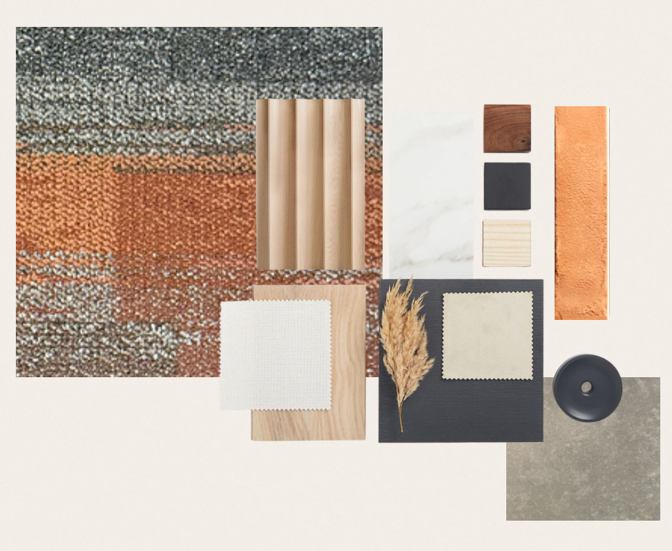
This month, I’ve been reflecting on how a colour palette can take shape when the space arrives with its own set of constraints.  It’s been a long time since I worked on a commercial project and myself and another designer were approached to help complete the furniture and lighting on a new build. The industrial exposed ceilings, concrete floors and an existing carpet finish meant I had to work with what was already there. The dominant greys and a bold orange weren’t the easiest starting point, but they set the direction.

As we developed the scheme, we explored materials and finishes through the furniture companies I often work with. Burnt orange and soft grey upholstery began to bring warmth and cohesion to the industrial shell, while speckled marble added the texture and balance the space needed.

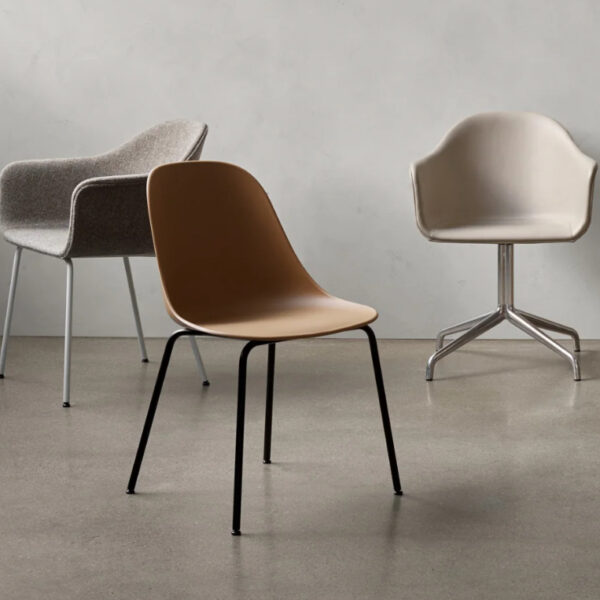
I also wanted to share some of the furniture choices we landed on, which you’ll see in the photos alongside this journal. They really illustrate how the palette came together and how the existing elements became part of the final story.

Keep on viewing to see some of the inspirations, textures and pieces that I selected for the project.

Putting together the palette for the project by bringing in burnt and terracotta orange with deeper shades of grey, contrasted with the light oak
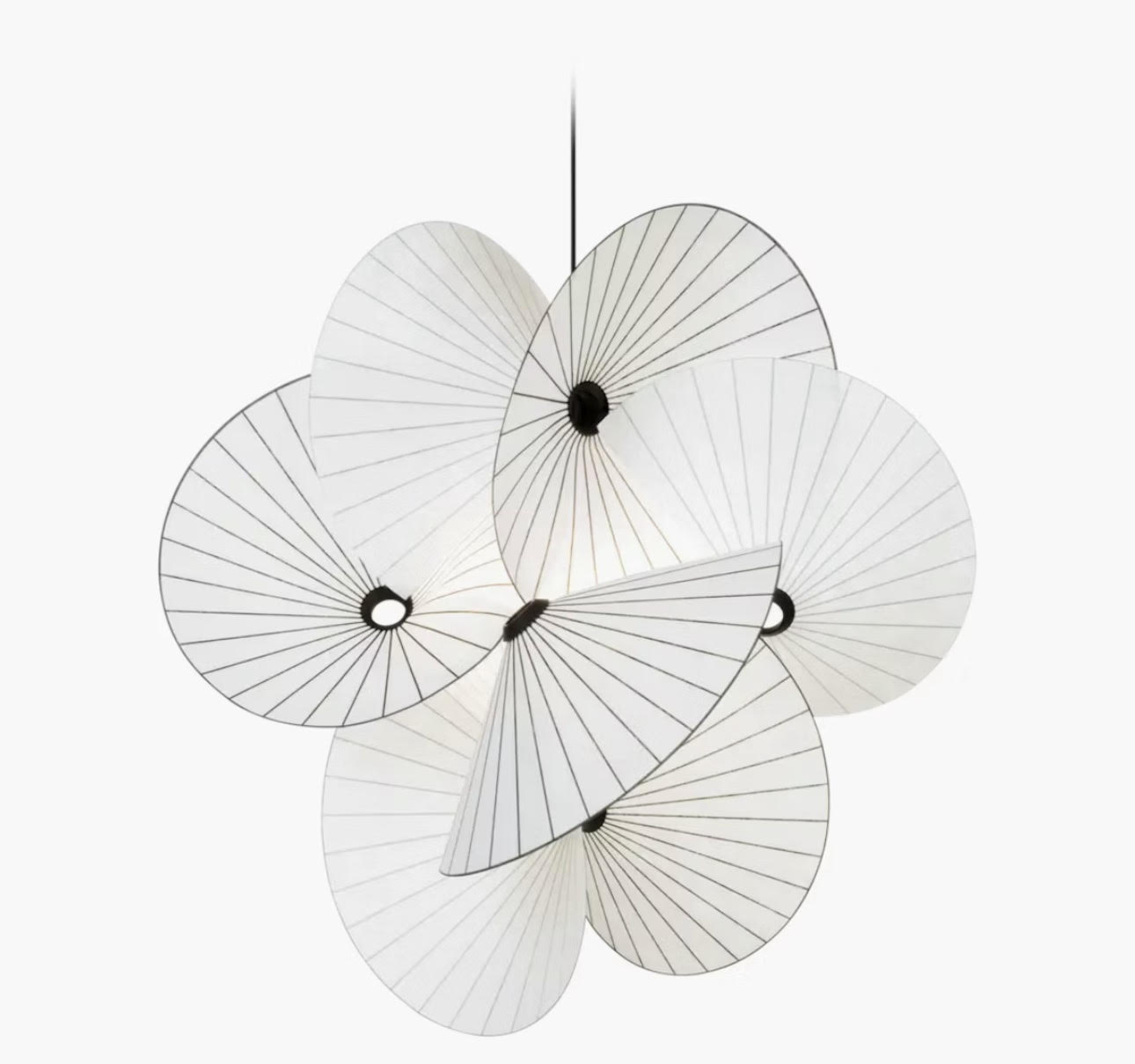
The Moooi Serpentine light which hangs in the atrium
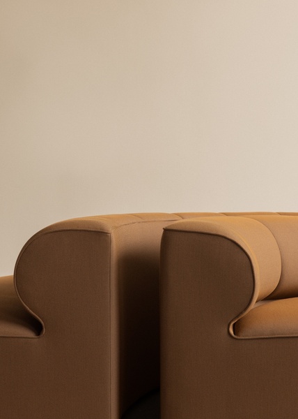
Details from Audo
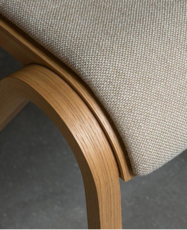
The Harbour range from Audo
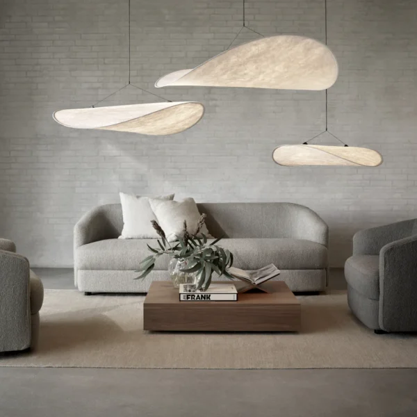
New Works Tense lighting pendants
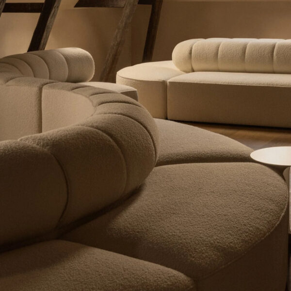
Audo details